Custom CSS
Contents
Custom CSS lets you go further than the theme: squarer buttons, colored subheadings, more compact cards. Your rules are added after the theme on every page and survive updates. This lesson shows where to write them and which variables to use, and gives examples tested on Atelier Nova's site.
What you'll be able to do
Write rules that last
Know where to enter your CSS, how it applies and why it survives updates.
Customize without breaking anything
Use the theme's variables to respect colors, dark mode and contrast.
Test properly
Check your rules in the preview, in Visual mode and in dark mode.
Where do you enter your custom CSS?
- Open Settings › Appearance and scroll down to the Custom CSS field, below the footer text.
- Paste or write your rules.
- Click Save: the site's cache is cleared and your rules apply right away on every page.
The field says so itself: your CSS is “added after the theme on every page, so it takes precedence over it”. It's inserted into each page's <style> tag, after the base stylesheet and the one for the theme or art direction: with equal selectors, your rule wins. It's stored with your data, in data/, a folder that updates don't touch, and it's included in the ZIP backup from the Security page.
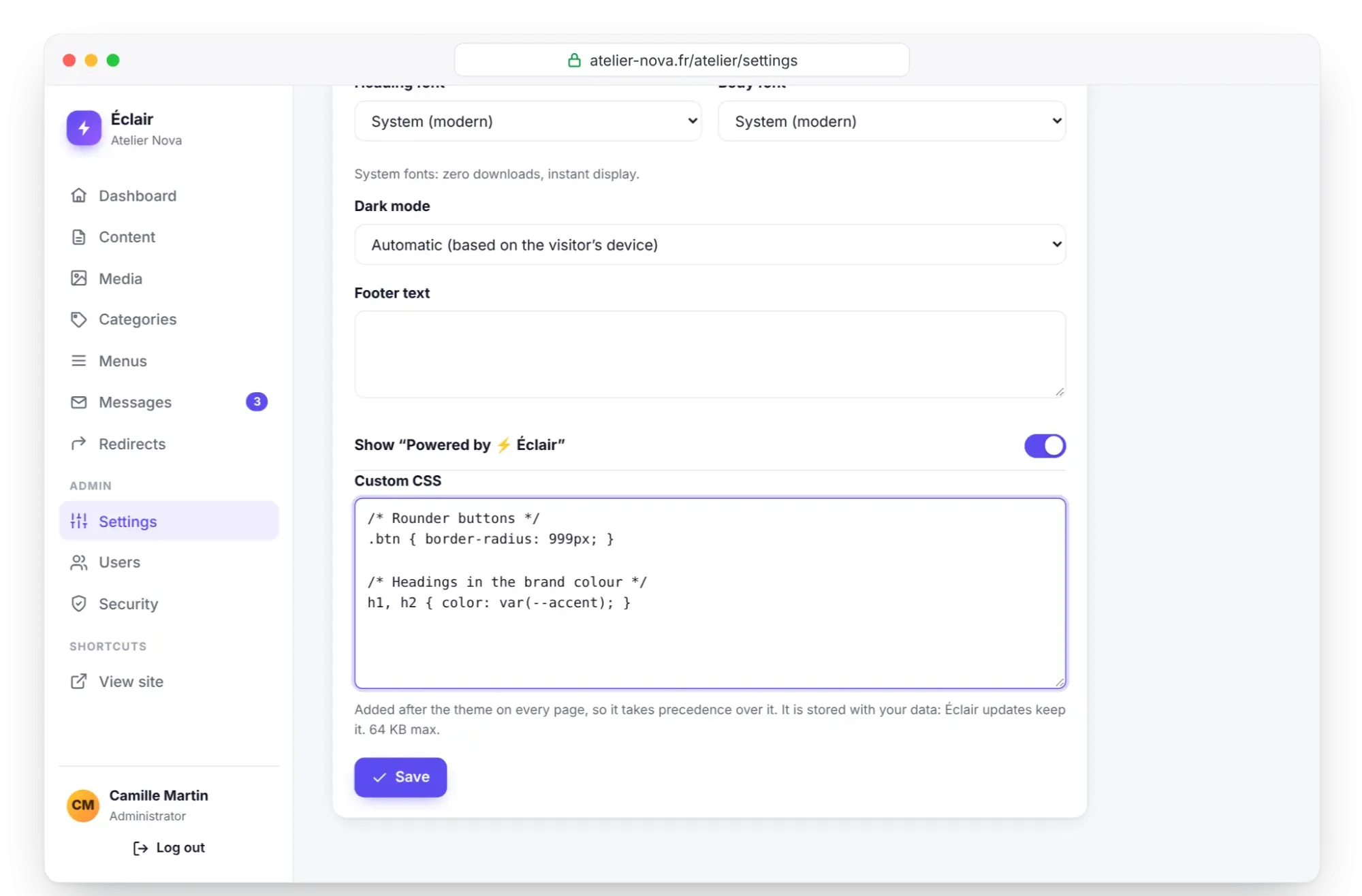
The field's security rules
Because this CSS is inserted into every page, Éclair cleans it before saving it:
- the
<character is removed, so that no rule can close the style tag: the@media (width < 40rem)syntax therefore doesn't work, so write@media (max-width:40rem)instead; @importrules are removed: no external stylesheet can block rendering;- invisible control characters are deleted;
- the size is limited to 64 KB, and beyond that, saving is refused;
- your
/* … */comments stay in the field, but the page receives a compact version without them.
Theme variables to use
The theme describes its colors and shapes with CSS variables. Use them rather than fixed values: in automatic dark mode, the theme redefines these variables and your rules follow without any extra work. A rule with background:#fff would stay white on a site that has turned dark; with background:var(--card), it adapts.
| Variable | Role |
|---|---|
--accent | Main color: button background, bullets, rules |
--link-c | Link color, contrast checked: prefer it for colored text |
--bg | Page background |
--bg-soft | Soft background: footer, table of contents, callouts |
--card | Background of cards and FAQ questions |
--text | Text color |
--muted | Secondary text: dates, captions, excerpts |
--line | Rules and borders |
--radius | Rounding of cards, features and the table of contents (16 px in the Éclair theme) |
--shadow | Shadow of cards and features (none in Studio, Editorial and Contrast) |
--font and --font-head | Body font, heading font |
--text-w | Width of the reading column (42rem by default) |
Art directions define the same variables, plus --btn-r for button rounding: your rules work with both. One exception: don't redefine --accent. Éclair calculates the button text and the link color from the main color; a color changed in CSS would escape this contrast calculation.
Commented examples for Atelier Nova
Each example can be pasted as is. Add them one at a time and look at the result before moving on to the next one.
/* Subtler corners and a slightly wider reading column */
:root{--radius:10px;--text-w:46rem}

/* Buttons: corners matching the cards, spaced capital letters */
.btn{border-radius:var(--radius);text-transform:uppercase;letter-spacing:.06em}

/* H2 subheadings in your texts: link color, contrast checked */
.content>h2{color:var(--link-c)}
The .content>h2 rule only targets the subheadings in your texts: the headings of a FAQ or a Features block live in their own section and stay untouched.
/* Banner: a less massive title, tagline in the text color */
.hero-title{font-size:clamp(2rem, 1.5rem + 2.4vw, 3.2rem)}
.hero-lead{color:var(--text)}

/* Post cards: 4/3 photo, excerpt limited to 2 lines */
.card-img img{aspect-ratio:4/3}
.card-excerpt{-webkit-line-clamp:2}

/* FAQ: the open question stands out */
.faq details[open]{border-color:var(--accent)}
.faq details[open] summary{color:var(--link-c)}

/* Callouts with a line on the left, underlined footer */
.callout{border-left:4px solid var(--accent)}
.site-footer{border-top:3px solid var(--accent)}

/* On phones, a more compact banner */
@media (max-width:40rem){.hero{padding-top:2rem;padding-bottom:1rem}}
Two theme markers also work in your CSS. Rules placed between /*dark*/ and /*/dark*/ disappear when dark mode is set to “Always light”. Those placed between /*shop*/ and /*/shop*/ are only sent if the shop is open.
/*dark*/@media (prefers-color-scheme:dark){
  .hero-img img{filter:brightness(.9)}
}/*/dark*/

/*shop*/
.price .price-now{color:var(--link-c)}
/*/shop*/Why doesn't your rule apply?
Your CSS comes last: with equal selectors, it wins. But a more specific theme selector still takes precedence. Three real cases: the drop cap on posts in the Editorial theme (.content.post>p:first-of-type::first-letter), card images in list mode (.cards-list .card-img img) and square product photos (.product-card .card-img img). The solution is to reuse the same selector:
/* Editorial theme: no drop cap at the start of posts */
.content.post>p:first-of-type::first-letter{float:none;font:inherit;margin:0;color:inherit}
To target a type of page, the <body> tag carries useful classes: is-post for a post, is-page for a page, is-list for the blog and categories, hdr-center for the centered header, cards-list for lists in list mode. Avoid !important: the rule becomes very hard to fix later.
Test your rules without surprises
- Write one rule at a time, with a comment that says what it does.
- Click Save, then look at the Live preview: the home page, a post, then the shop if it's open, on Desktop and Mobile.
- Open a page in the editor in Visual mode and switch to the 390 px width.
- If dark mode is set to “Automatic”, switch your device to dark mode and reload the site.
- Keep a dated copy of your CSS in a text file.
Key points
- Your CSS goes in Settings › Appearance, is added after the theme and survives updates.
- Write with the theme's variables (
--bg,--text,--link-c…) to follow dark mode. - Never change the main color in CSS: use the dedicated setting.
- The
<character and@importrules are removed, and the field accepts 64 KB at most. - Save, then check in the preview, in Visual mode and in dark mode.
Going further
- Themes and appearance: what each theme already sets, before you write a single line.
- Customize the theme templates: when CSS is no longer enough and you need to change the HTML.
- Performance: staying at 100 out of 100: why every kilobyte of CSS counts.
- Sources: using CSS custom properties and prefers-color-scheme, on MDN.
Frequently asked questions
Does my custom CSS disappear when Éclair is updated?
No: it's stored in the data/ folder, which the update procedure doesn't touch. It's also part of the ZIP backup downloaded from the Security page.
Why doesn't my “width < 600px” condition work?
For security, Éclair removes the < character from your CSS. Write the condition with max-width, for example @media (max-width:37.5rem).
Can I import a Google Fonts typeface?
No: @import rules are removed and the site's security policy only accepts fonts served by your site. If you really want a typeface, go through an art direction.
Does my CSS slow down the site?
It's inserted into every page, in compact form. A few dozen lines weigh only 1 or 2 KB: keep it short and delete the rules you no longer need.
Why don't my changes show up in the preview?
The live preview and Visual mode use the saved CSS. Click Save, then reload the preview; on the public site, the cache is cleared automatically.