Art directions and Design score
Contents
An art direction gives your site a complete visual world: palette, heading typeface, heading size, corners, banner layout, features layout. This lesson teaches you how to choose among the 12 directions, adjust them, have the AI imagine three for you and aim for 100 on the Design score, with Atelier Nova as the example.
What you'll be able to do
Give your site a visual world
Choose and adjust one of the 12 directions, live on your site.
Get 3 directions suggested
Describe your business and let the AI start from your concrete world.
Aim for 100 on the Design score
Understand each check and fix a page.
Theme or art direction: what changes
A theme mostly changes colors; an art direction changes the entire visual world, starting from a concrete idea: the city at night, the ceramics studio, the morning paper. The HTML doesn't move: URLs and structured data stay the same.
| Classic theme | Art direction | |
|---|---|---|
| Colors | One main color | 5 colors: background, bands and cards, text, secondary text, accent |
| Heading font | System font | 18 typefaces downloaded once, or a system font |
| Layout | Header and lists | Plus: case, heading size, corners, spacing, cards, banner, features, sections, icons |
| Dark mode | Automatic or always light | The direction sets a light or dark background |
The 12 directions and their visual worlds
| Direction | Visual world | Heading typeface | Background |
|---|---|---|---|
| Nocturne | The city at night: deep blue, amber light | Big Shoulders Display, all caps | Dark |
| Gallery | White walls, black labels, a signage red | Familjen Grotesk | Light |
| Clay | The ceramics studio: sand, terracotta, soft shapes | Young Serif | Light |
| Botanical | The herbarium and the greenhouse: deep green, sage paper | DM Serif Display | Light |
| Poster | The Swiss poster: black on off-white, bright orange | Archivo Black, all caps | Light |
| Riviera | The seaside: navy blue, pale sky, coral | Gloock | Light |
| Chambers | The letterhead: navy ink, burgundy, fine rules | Libre Caslon Display | Light |
| Neon | The creative screen at night: near-black, lime green | Unbounded | Dark |
| Gentle | The treatment room: powder pink, plum, plenty of air | Cormorant Garamond | Light |
| Worksite | Concrete, safety yellow, condensed signage | Barlow Condensed, all caps | Light |
| Playtime | The schoolyard: sky blue, tomato red, round letters | Fredoka | Light |
| Press | The morning paper: newsprint, front-page red | Newsreader | Light |
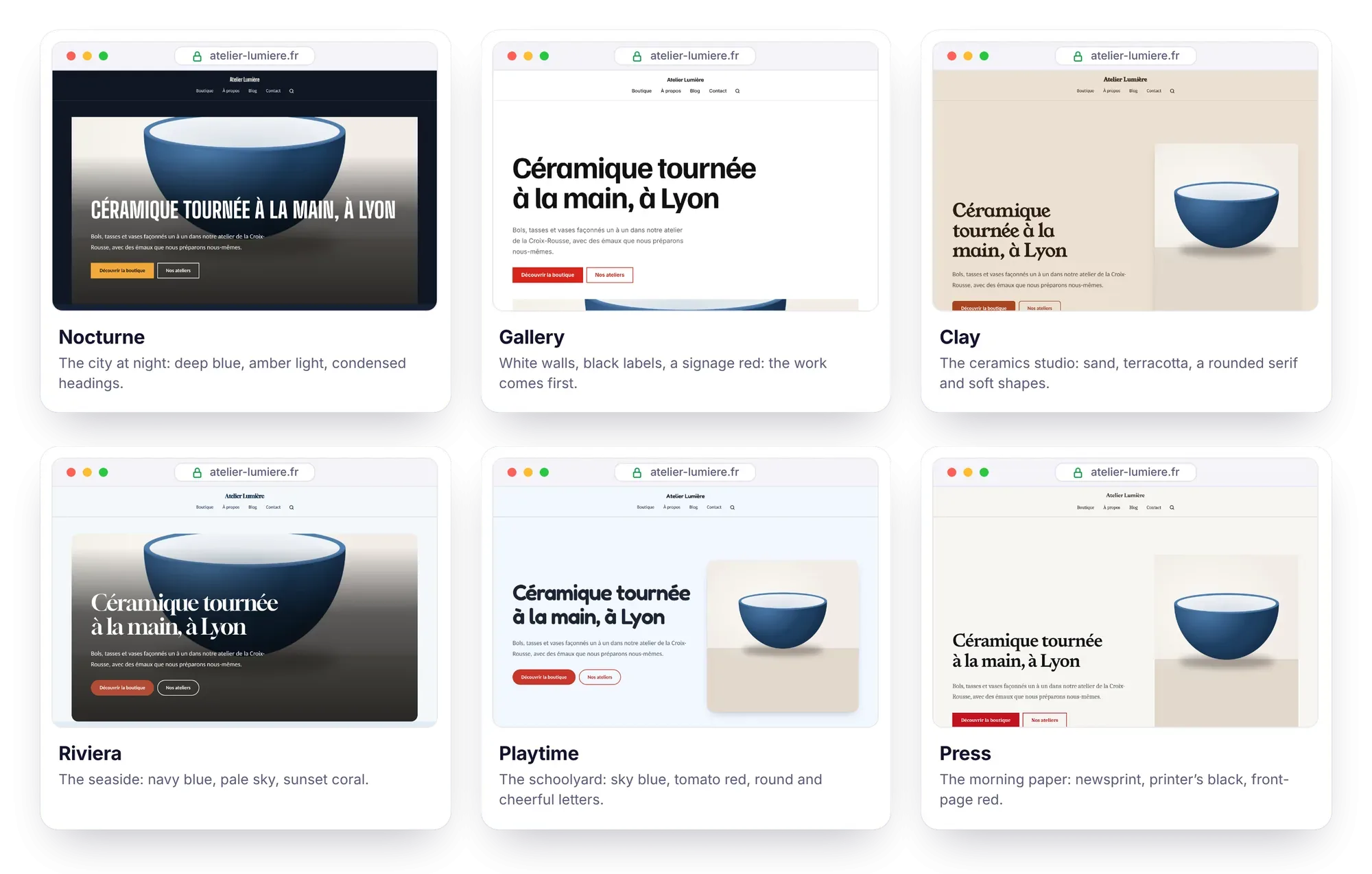
For Atelier Nova, Clay seems made for it: sand background, terracotta accent, the Young Serif typeface, drop-shadow cards and the “Editorial: portrait image” banner. Don't stop at the name: Riviera or Press would also work, depending on the tone you want.
How do you choose and adjust an art direction?
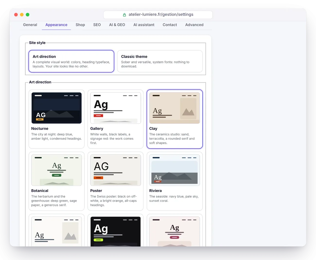
- Open Settings › Appearance and, under Site style, choose Art direction.
- Click one of the 12 cards: the live preview shows your real site, on Desktop or Mobile.
- Expand Adjust the direction: colors, typefaces, layouts and change whatever you like. The preview follows each change.
- Click Save. Nothing is published before that.
| Setting | Possible choices |
|---|---|
| Colors | Background, Bands and cards, Text, Secondary text, Accent |
| Heading font | 18 typefaces, or a system font |
| Body font | 6 system fonts: System, Humanist, Geometric, Rounded, Modern serif, Elegant serif |
| Heading case | Normal, Capitals |
| Heading size | Subtle, Balanced, Dramatic |
| Corners | Square, Softened, Round |
| Spacing | Compact, Normal, Airy |
| Cards | Thin border, Flat color, Drop shadow |
| Home banner | Text and image side by side, Poster, Full-bleed image, Editorial, Centered |
| “Features” block | Cards, Rows, Ruled columns |
| Sections | Plain background, Color bands |
| Feature icons | Line icons, No icon, Emoji |
The 18 heading typefaces each have their own personality. Serif: Bodoni Moda, Cormorant Garamond, DM Serif Display, Young Serif, Gloock, Libre Caslon Display, Newsreader. Slab serif: Zilla Slab. Sans serif: Bricolage Grotesque, Schibsted Grotesk, Familjen Grotesk, Archivo Black, Syne, Unbounded, Sora. Condensed: Big Shoulders Display, Barlow Condensed. Rounded: Fredoka.
Contrast and speed: what Éclair guarantees
Always readable: whatever colors are chosen, by you or by the AI, Éclair adjusts the text to reach a 7:1 contrast against the background, and the secondary text, links and buttons to reach 4.5:1, including on backgrounds tinted with the accent color (badges, menu, highlighting). This calculation was verified on 20,000 randomly drawn palettes.
Always fast: the heading typeface, 12 to 27 KB, is downloaded only once by your server from Fontsource (under the SIL Open Font License), stored in media/fonts/, then served by your site and preloaded. Your visitors don't call any third-party service and the layout doesn't jump. Only the CSS rules your direction needs are inlined in the page. Measured with Lighthouse: 100 in all four categories with Nocturne, Riviera, Press and Poster.
Imagine my direction with AI
When the AI assistant is turned on, the Imagine my direction with AI field appears below the cards. Describe your business, your audience and the mood you're after in one or two sentences, then click Suggest 3 directions. Here is Atelier Nova's description:
Ceramics studio in Lyon, classes for adult beginners and made-to-order pieces.
A calm, bright mood, somewhere between raw material and precise gestures.
The AI also reads your site's description and your editorial profile, then follows Impeccable's method:
- start from the concrete world of the business: places, materials, objects, light;
- give each suggestion a precise reference;
- suggest three genuinely different directions;
- avoid the category's clichés and the tics of “AI-generated design”.
The three suggestions are added at the top of the cards, marked ✦: click one to see it in the preview, adjust it, then save the one you like. The AI only picks from Éclair's settings and never writes CSS: each suggestion is checked and its contrast corrected. The estimated cost is shown with the field, about $0.03 with Claude Sonnet 5.5, taken from the assistant's budget.
How do you aim for 100 on the Design score?
In the editor, the Analysis tab shows a third ring, Design, next to SEO and GEO. It checks that the page holds up visually. The tab's score is the average of the three rings, and the list puts the red items first.
| Check | What's expected |
|---|---|
| Subheading hierarchy | No level jumps: H2, then H3, then H4 |
| Subheading length | 12 words at most, no decorative emoji |
| Banner title | 8 words at most, 6 if your direction sets headings in capitals |
| Banner | A call-to-action button, and an image if the layout is “full-bleed” or “editorial” |
| Calls to action | 3 buttons at most on the page |
| “Features” block | 3 to 6 described items, with emoji that have a line-drawn icon |
| Text | No sentences in all caps, no empty buzzwords, no overuse of em dashes |
| Repetition and rhythm | No passage repeated word for word, no more than 350 words of paragraphs in a row |
| Site | An art direction is chosen |
Empty buzzwords are the vague superlatives and advertising jargon that the analysis spots in the page's language: replace them with a concrete fact. For features, choose emoji that have a line-drawn icon: an emoji with no equivalent shows nothing, and the analysis points it out.
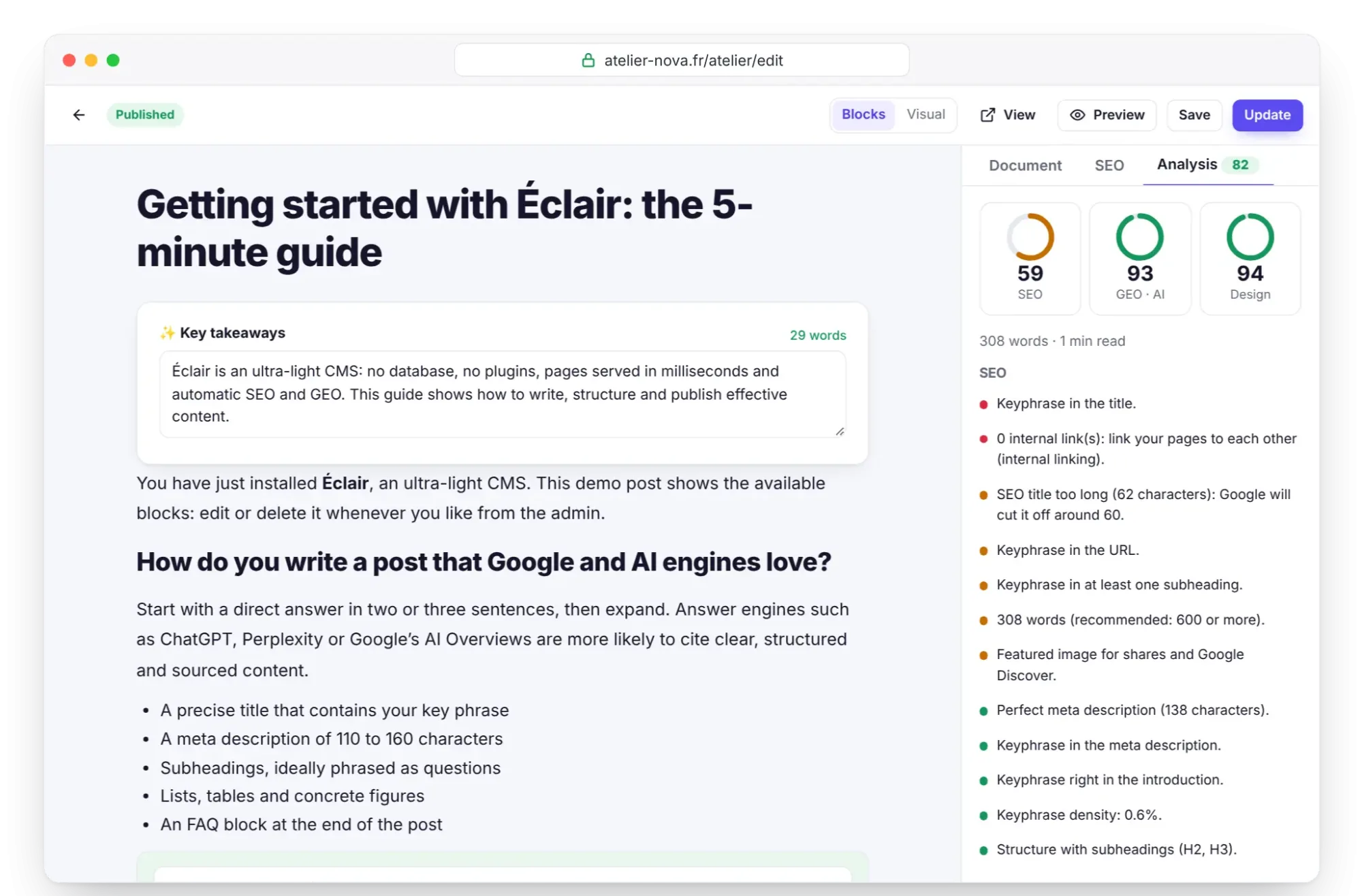
Example: with Clay, Atelier Nova's home page shows “Add an image to the banner: your art direction's layout needs one.” The editorial layout expects a portrait photo: once a photo of a potter's wheel is added, the item turns green.
The method and safeguards of the Design score, like those of the AI's suggestions, are adapted from Impeccable, by Paul Bakaus, released under the Apache 2.0 license.
Key points
- An art direction changes the site's complete visual world, without touching the HTML.
- The 12 directions can be adjusted: 5 colors, 18 heading typefaces, banner and features layouts.
- Contrast is guaranteed: 7:1 for text, 4.5:1 for everything else.
- The typeface is downloaded once by your server, then served by your site.
- Read the Design score in the Analysis tab, and fix the red items first.
Going further
- Themes and appearance: the shared settings, such as the header, lists, logo and footer.
- Custom CSS: touch up a detail that the direction's settings don't cover.
- Performance: staying at 100 out of 100: the weight of fonts and CSS, measured and explained.
- Sources: the Impeccable method by Paul Bakaus, and the Fontsource catalog the typefaces come from.
Frequently asked questions
Does an art direction slow down my site?
Very little: a single heading typeface of 12 to 27 KB, served by your site, and only the CSS rules that are needed. Lighthouse stays at 100 with Nocturne or Press, for example.
Can I go back to my classic theme?
Yes: choose Classic theme and save, and your old theme's settings are still intact. Note your colors first if you adjusted your direction, because it isn't kept when you switch back to the classic theme.
Can the AI damage my site by suggesting a direction?
No: its suggestions go through the same checks as your own settings, contrast included. Nothing is saved until you click Save.
Does the Design score count for Google?
No, it's an indicator for you, calculated in the editor. It's not part of the SEO score or the GEO score.